Budownictwo
Dom
Ogród
Wnętrza
Porady
Budownictwo
Dom
Ogród
Wnętrza
Porady
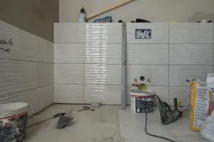
Agregaty tynkarskie od producenta – czy to realna przewaga w pracy?
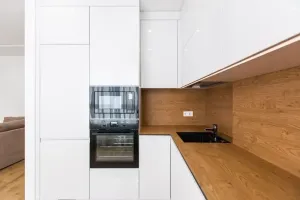
Kuchnie na wymiar Bielsko-Biała – montaż i gwarancja od producenta
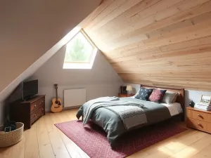
Czym ocieplić poddasze? Przegląd materiałów
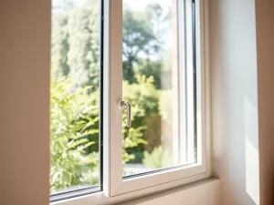
Okna aluminiowe DOOR Filipek – energooszczędne rozwiązania do domu
Budownictwo
Jak obudować basen – pomysły i porady
Czym jest strop i jakie ma funkcje?
Jak zmierzyć kąt bez kątomierza?
Z czego produkuje się cement?
Ile waży standardowa płyta gipsowa?
Jak zaplanować i zrealizować dach czterospadowy?
Dom
Jakie obrazy wybrać do kuchni?
Co powiesić na ścianie w przedpokoju?
Jak dobrać obrazy na ścianę do salonu?
Obrazy idealne do łazienki – sztuka w domu
Jakie obrazy wybrać do pokoju dziecka?
Jak urządzić przytulny salon? Pomysły na ciepłe i stylowe wnętrze
Ogród
Jak przygotować glebę do sadzenia? Klucz do udanych upraw
Kalendarz prac ogrodniczych na cały rok – co robić w każdym miesiącu
Jak zrobić kompost w ogrodzie? Ekologiczne i proste rozwiązania
Jak stworzyć ogród przyjazny dla pszczół? Rośliny i techniki, które pomogą naturze
Jak założyć ogród warzywny od podstaw? Praktyczny poradnik dla każdego
Poradnik uprawy roślin doniczkowych – pielęgnacja i wybór idealnych gatunków
Porady
Jak zrobić ścianę działową? Tworzenie dodatkowych przestrzeni w domu
Jak zrobić betonową ścieżkę – trwałe i estetyczne rozwiązanie do ogrodu
Jak zamontować panele podłogowe? Poradnik dla majsterkowiczów
Jak zamontować drzwi wewnętrzne? Kompleksowy przewodnik
Jak naprawić nieszczelny kran? Proste rozwiązania na domowe problemy
Jak zbudować domową saunę? Luksusowy relaks we własnym domu
Wnętrza
Najlepsze podłogi do domu z dziećmi – trwałość i bezpieczeństwo
Porady dotyczące izolacji domu – ciepło i oszczędności w jednym
Planowanie budowy domu od podstaw – krok po kroku
Najlepsze sposoby na oszczędzanie energii w domu
Jak przygotować dom na zimę? Porady i checklista
Jak zaaranżować niewielki pokój dzienny w mieszkaniu – inspiracje na praktyczne i komfortowe wnętrze
Potrzebujesz więcej informacji?
NAPISZ DO NAS